
Magazine: NME
The core colour scheme of this front cover is mainly black with a combination of white and gold in the title. White, gold and a hint of blue is used in the background as stars to make it look magical, this coincides with the main person on the cover 'Michael Jackson'. The main image of the singer is the only one used for this frontpage, this is to show the audience that this magazine is only focusing on Michael Jackson. The theme that the cover portrays relates to the aura that surrounded the singer, presented through his music, his dancing and in his personal life because even though he got older, he still behaved child like.
The title ' Michael Jackson' is in capitals and is highlighted in white, it takes up the entire width of the page. It is not as large as the name of the magazine 'NME' which is short and easy to remember, it is placed underneath the title on the left hand side, the text is in block capitals and is highlighted in gold, with a white outline. For this the title is situated behind the singer on the page, this is done to ensure the entire image of the person is displayed, and shows us that there are 2 or more layers used in the design. To the right of the NME title is ' Tribute special', this title is the smallest out of the three and is highlighted in gold.
On this frontpage the main focus is clearly on this singer, there is very little in the background to distract the reader from the main image. There is very little other text on the cover, except a sticker of what features inside the magazine and text in the bottom right hand corner of the page '1958-2009, therefore nothing really supresses the main image.
The website, date of the magazine and the price of the magazine is displayed under 'NME' and is the smallest sized text on the page making it quite discrete, this text alternates between white and gold. There are no sub stories at all on the front cover as this magazine is focused on just one man and one main story.
The image used on the front cover displays a medium shot of the singer Michael Jackson , and shows the singer with his thumb up, giving the impression that throughout his life he always tried to be positive in his music career and his private life, he is looking straight at the camera and even though he is wearing blacked out sunglasses, the audience still know he is making eye contact with them. As this a medium shot of the singer, the audience are able to see his emotions through his body language being displayed.
The image shows a more light hearted, child like theme the background harmonizes with Jackson's clothing, by doing this it shows that they want to target this magazine for people of all ages, children who would be drawn to the magazine as a result of the theme, also teenagers and adults who would be old enough to know who Michael Jackson is and love his music, therefore would most probably buy the magazine because of the singers interesting and headlining life. The colour of his clothing corresponds with the colour scheme of the page, the singer's black jacket almost blends into the black background, the gold design on his clothes coincides with the gold coloured text and the white glove stands out dramatically. His head overlaps the main titles slightly.
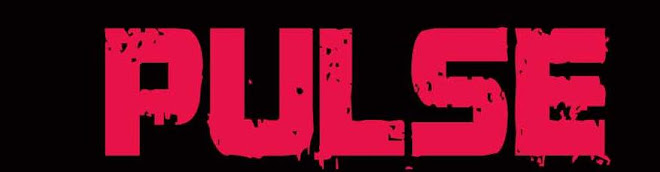
A PUG is located on the left hand side of the page just underneath the title 'NME', it is highlighted in red and contrasts with the colours on the rest of the page, by doing this it would almost immediately draw the readers attention to it, the text inside alternates between coloured black and white.
The Bar code is placed in the bottom left hand corner, it is not very big and its positioning makes it discrete, it doesn't draw the reader's attention and ensure that the reader does not have the price of the magazine come to mind straight away.
No comments:
Post a Comment